S&P500 Series Pt. 1: Technical Analysis
Previous articles have often referred to the S&P500 index. As an investor, understanding this index is essential for navigating the market. This series aims to elaborate on the topic from a variety of angles. We will explore the technical analysis component of the Index, its historical and political relevance, and it’s influencing factors. This foundational knowledge will aid prospective investors to take more confident and calculated positions.
The first part of this series will dive into the previously discussed topic of Technical Analysis. We will link direct concepts from TA to real life cases of the S&P500 index. This will serve as a direct example of how TA can be used practically and in real time. Due to its nature (which will be expanded upon in the next instalment), the S&P500 works as a reliable reference for various indicators and tools available for use to any investor. The following examples are taken from approximately the last year, and AMSA encourages further exploration of these market events.
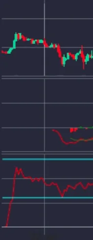
This graph, which represents the S&P500 index from the 18th of January up to the 6th of March, will be the subject of our further analysis.
RSI
(18/01 - 23/01)
The Relative Strength Index (RSI) represents the oversold or overbought condition of the security.
The two horizontal blue lines indicate the borders of the overbought (top line) and oversold (bottom line) region. The bottom line represents the value of 30 (below this number means the asset is oversold), whilst the top line represents the value of 70 (above this number means the asset is overbought)
Once the RSI crosses one of the two lines, the investor can use this information to take a relatively confident, short or long position in the index.
As the security represents 505 American stocks, by nature its volatility will be hedged (its fluctuation will be eased). When applying TA, the lower levels of unpredictable volatility increases the credibility and reliability of the analysis performed.
On the extreme left of the graph (18/01/2019) you can see that at that time, the S&P500 was highly oversold. It fluctuated between 6 and 8. This represents a clear signal for a long-position, as indicated by the immediate increase in price right after.
Shortly following the recovery from oversold (20/01/2019), the index rose to almost touching the overbought border of 70. In this case, a very clear short position presented itself, indicated here by the gradual decline in S&P price.
MACD
(22/01 - 24/01)
On the 23/01/2019, a signal coming from the MACD indicator occurred. On the graph, at the referred point, one can witness the red line crossing the green. This is a clear bullish signal and the price experienced an increase accordingly.
The RSI in that case could have acted as a confirmation, but not necessarily as a reliable indicator as it was not significantly close to either the overbought or oversold limit.
It fluctuated in the area below 50, which can be a signal (though a very weak one) that it was in an oversold condition.
Thus, in that period, a long position would have been a smart technical move.
MACD
(27/01-28/01)
The next interesting MACD signal occurred on the 28/01/2019. The red line crossed the green one to indicate a short position. In this case, as the RSI was still not in extreme ranges it could have acted as confirmation only.
Volume
On the extreme left side of the above graph, up until the month of October there is a very substantive, steady increase in price. Reading from the left, the volume lines from 2-7 represent bullish volume trading. As an investor during that period you can be confident in holding your position, when an increase in price is matched with bullish trade volumes. This can be combined with other indicators for even further confirmation. This same principle works in the opposite direction as well. For instance, if the price is dropping and the bearish volume is increasing (increasing red volume), you can keep your short position without being afraid of a fast reversal. This is specifically evident when looking at the volume trades of December 14 until 2019; where the continuous falling of prices was matched by increasing levels of bearish trade volume.
RSI
On 05/02/2019 the RSI finally touched the overbought limit (exceeded 70). The MACD however found itself very close, yet not crossing the orange line. In these cases, it is more beneficial to wait for a stronger signal to appear, before committing to a short position.
On the 6th of March, the MACD fell below the orange line and thus a high RSI combined with a falling MACD would be a reliable indication for a successful short position.
Volume
On the Yahoo Finance graph, you can witness two increasing bearish volume lines on the 05/02/2019 and 06/02/2019. These confirm that a short term (two day) short position would be profitable.
Two more points in reference to the previous Yahoo graph are relevant for our exploration of TA on the S&P500 graph. They are subject to the exact same logical procedure as the aforementioned points. AMSA therefore recommends that any aspiring investor practices utilising these analysis tools to further strengthen their ability to make profitable trades.
Short: 13/02/2019
RSI: High
MACD: crossing
Short: 25/02/2019
RSI: High
MACD: crossing
Editing by Isabel Lihotzky


